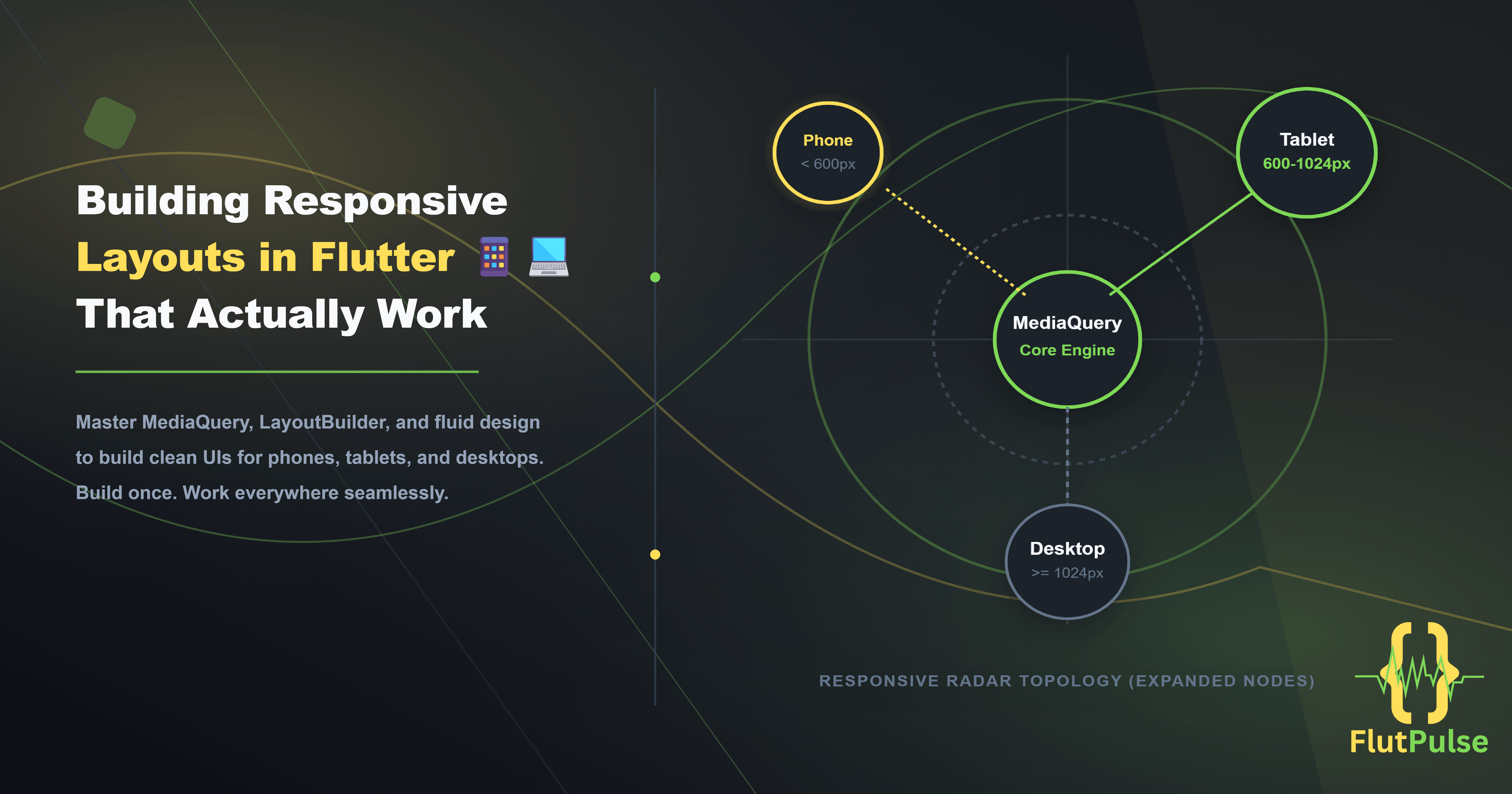
Building Responsive Layouts That Actually Work on All Screen Sizes 📱💻
Published on: September 01, 2026
Introduction
Most Flutter developers build for phones first — and only think about tablets and desktops when they have to.
But Flutter is uniquely positioned to target all screen sizes from a single codebase. Achieving this isn’t about special packages or complex frameworks. It’s about a disciplined approach to how you measure space and make layout decisions.
The Wrong Approach: Hardcoded Dimensions
The fastest path to a broken layout is hardcoding pixel values:
// ❌ Breaks on anything but the device you tested on
Container(
  width: 390,
  height: 844,
  child: ...,
)
A phone is 390px wide. A tablet is 768px. A desktop is 1440px. Hardcoded values satisfy exactly one of these.
The Foundation: MediaQuery
MediaQuery.of(context) gives you the actual dimensions of the device screen:
final screenWidth = MediaQuery.of(context).size.width;
final screenHeight = MediaQuery.of(context).size.height;
Use percentages of the available space rather than fixed values:
// ✅ Scales correctly across all screen sizes
Container(
  width: screenWidth * 0.9,
  padding: EdgeInsets.symmetric(
    horizontal: screenWidth * 0.05,
  ),
  child: ...,
)
Define Breakpoints
Establish clear thresholds for different screen categories:
class ScreenSize {
  static bool isPhone(BuildContext context) =>
      MediaQuery.of(context).size.width < 600;

  static bool isTablet(BuildContext context) =>
      MediaQuery.of(context).size.width >= 600 &&
      MediaQuery.of(context).size.width < 1024;

  static bool isDesktop(BuildContext context) =>
      MediaQuery.of(context).size.width >= 1024;
}
These breakpoints align with Flutter’s own platform guidelines and common device categories.
Adapting Layouts with LayoutBuilder
LayoutBuilder provides the constraints of the parent widget, giving you more precise control than MediaQuery:
LayoutBuilder(
  builder: (context, constraints) {
    if (constraints.maxWidth < 600) {
      return const PhoneLayout();
    } else if (constraints.maxWidth < 1024) {
      return const TabletLayout();
    } else {
      return const DesktopLayout();
    }
  },
)
LayoutBuilder is preferred over MediaQuery for individual component layouts because it responds to the space available where the widget is placed, not the entire screen.
Responsive Grids with GridView
Replace fixed-column grids with adaptive ones:
// ❌ Always 2 columns regardless of screen size
GridView.count(crossAxisCount: 2, ...)

// ✅ Adapts column count to available width
GridView.builder(
  gridDelegate: const SliverGridDelegateWithMaxCrossAxisExtent(
    maxCrossAxisExtent: 200,
    crossAxisSpacing: 16,
    mainAxisSpacing: 16,
  ),
  ...
)
SliverGridDelegateWithMaxCrossAxisExtent automatically calculates how many columns fit without you specifying a count.
Fluid Typography
Text sizes should scale with the device, not stay fixed:
double responsiveFontSize(BuildContext context, double base) {
  final width = MediaQuery.of(context).size.width;
  if (width < 600) return base;
  if (width < 1024) return base * 1.2;
  return base * 1.4;
}

// Usage
Text(
  'Hello',
  style: TextStyle(fontSize: responsiveFontSize(context, 16)),
)
Safe Areas and Notches
Always wrap your top-level layout in SafeArea to avoid overlap with system UI:
Scaffold(
  body: SafeArea(
    child: YourContent(),
  ),
)
On devices with notches, dynamic islands, or bottom navigation bars, SafeArea inserts the correct padding automatically.
Adaptive Navigation
On phones, a BottomNavigationBar makes sense. On tablets and desktops, a NavigationRail or Drawer is more appropriate:
Widget build(BuildContext context) {
  final isWide = MediaQuery.of(context).size.width >= 600;

  return Scaffold(
    body: Row(
      children: [
        if (isWide)
          NavigationRail(
            destinations: _destinations,
            selectedIndex: _selectedIndex,
            onDestinationSelected: (i) => setState(() => _selectedIndex = i),
          ),
        Expanded(child: _screens[_selectedIndex]),
      ],
    ),
    bottomNavigationBar: isWide
        ? null
        : BottomNavigationBar(
            items: _destinations.map((d) => BottomNavigationBarItem(
              icon: d.icon,
              label: d.label,
            )).toList(),
            currentIndex: _selectedIndex,
            onTap: (i) => setState(() => _selectedIndex = i),
          ),
  );
}
Testing Responsive Layouts
In Flutter DevTools and the Android emulator, you can resize the window or switch between device profiles to test layouts without owning every device.
Use the Flutter Inspector to visualize layout boundaries and confirm widgets are occupying the expected space.
Conclusion
A responsive Flutter app isn’t a phone app that happens to run on a tablet. It’s a layout system that consciously adapts to whatever space it’s given.
The tools are all built in — MediaQuery, LayoutBuilder, SafeArea, adaptive navigation. The only thing required is the habit of designing with all screen sizes in mind from the beginning.
Build once. Work everywhere.