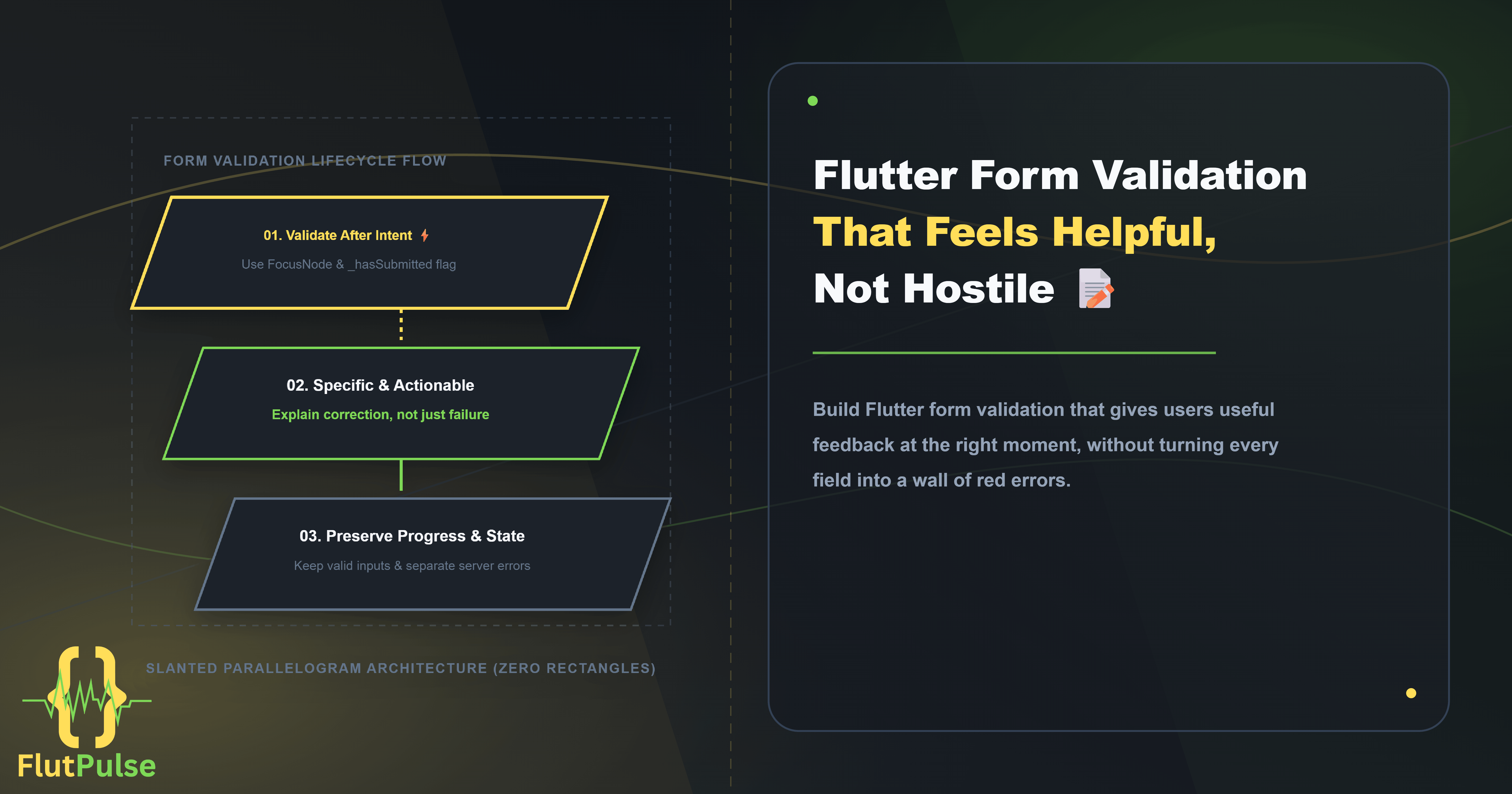
Flutter Form Validation That Feels Helpful, Not Hostile
Published on: September 19, 2026
Form validation is a product conversation. When it appears too early, it interrupts the user. When it appears too late, it makes a failed submission feel mysterious. A good Flutter form explains the next useful action without making the interface feel punitive.
A useful error tells the user what happened and how to recover. “Invalid input” rarely does either.
Validate after intent, not on the first keystroke
Showing an error while someone is still typing an email address creates visual noise. A better default is to validate a field after it loses focus, then validate all fields when the user submits.
class SignUpFormState extends State<SignUpForm> {
  final _formKey = GlobalKey<FormState>();
  final _emailFocus = FocusNode();
  bool _hasSubmitted = false;

  @override
  void initState() {
    super.initState();
    _emailFocus.addListener(() {
      if (!_emailFocus.hasFocus && _hasSubmitted) {
        _formKey.currentState?.validate();
      }
    });
  }

  @override
  void dispose() {
    _emailFocus.dispose();
    super.dispose();
  }
}
This approach gives first-time users room to complete a thought. Once they try to continue, the form becomes more proactive because the user has signalled intent.
Make each message actionable
Use a validator that describes the correction, not just the failure.
String? validateEmail(String? value) {
  final email = value?.trim() ?? '';

  if (email.isEmpty) return 'Enter your email address.';
  if (!email.contains('@')) return 'Add an @ to complete your email address.';

  return null;
}
Avoid using color as the only error signal. Pair an accessible message with a clear border treatment and enough spacing that it does not collide with the next field.
Keep server errors separate from field errors
Some errors belong to a field, such as an already registered email. Others belong to the whole form, such as a timeout. Treating both as field validators makes the interface confusing.
String? _formError;

Future<void> _submit() async {
  setState(() {
    _hasSubmitted = true;
    _formError = null;
  });

  if (!(_formKey.currentState?.validate() ?? false)) return;

  try {
    await widget.accountService.createAccount();
  } on TimeoutException {
    if (!mounted) return;
    setState(() => _formError = 'We could not reach the server. Try again.');
  }
}
Show _formError once near the submit action. It gives the user context without incorrectly suggesting that their text is the problem.
Preserve progress after a failed submission
Never clear valid values because one field failed. Keep the input, move focus to the first invalid field, and let the user make the smallest possible correction. That is especially important on mobile, where re-entering text costs more than it seems.
FilledButton(
  onPressed: _submit,
  child: const Text('Create account'),
)
The button code is simple. The experience comes from the state around it: intentional validation timing, specific messages, and a calm recovery path.
Build it faster with FlutFest
FlutFest includes reusable input, button, and feedback components that make it easier to keep validation states visually consistent across a product. Explore the live web demo for a practical starting point.