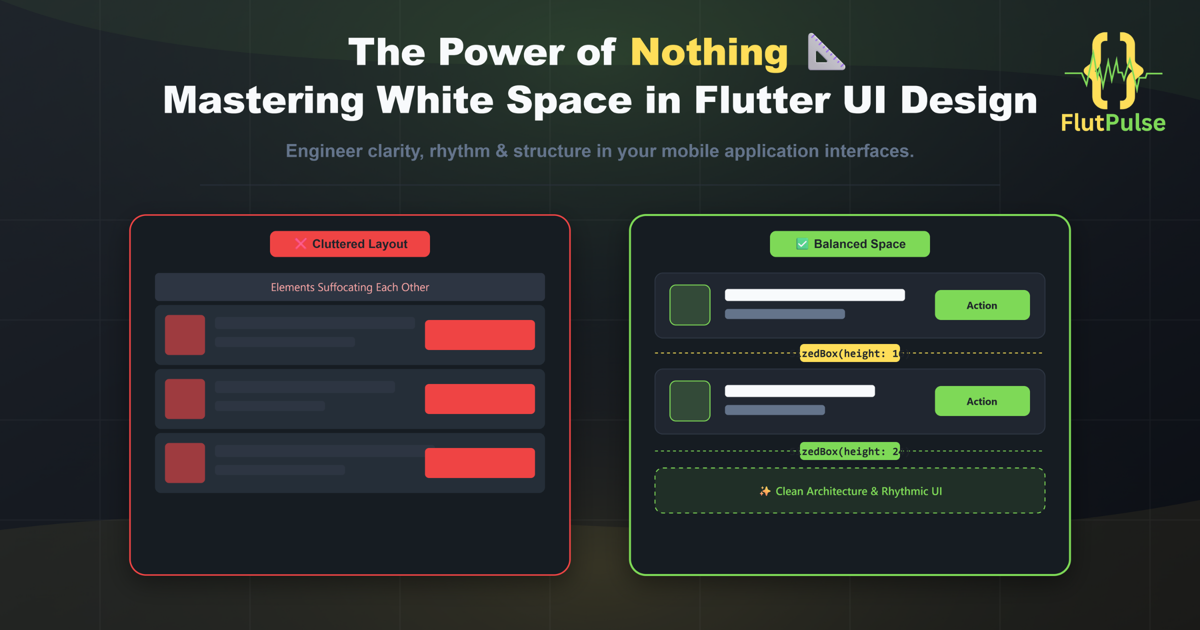
The Power of Nothing: Mastering White Space in Flutter UI Design
Published on: July 12, 2026
When building a mobile application, the temptation to utilize every available pixel is overwhelming. As developers, we naturally want to showcase features, display data grids, and provide users with immediate actions. However, the true hallmark of a premium application isn’t how much information it can display at once, but rather how effortlessly the user can digest that information.
This brings us to one of the most powerful, yet frequently misunderstood tools in a developer’s arsenal: White Space (or Negative Space).
Great design is largely invisible. When an interface feels “cluttered” or “heavy,” it is rarely a problem with the colors or the typography. More often than not, it is a structural failure caused by elements suffocating each other.
🛑 The Cost of Clutter
Cramming widgets together without proper breathing room directly impacts the user experience in several negative ways:
- Cognitive Overload: When buttons, texts, and images sit too close to one another, the user’s brain struggles to prioritize what to look at first. The hierarchy is lost.
- Accidental Touches: In mobile environments, tightly packed actionable widgets—such as
IconButtonorTextButton—lead to frustrating misclicks, heavily degrading the user’s trust in the application. - Loss of Elegance: An interface lacking proper margins inherently feels cheap and rushed, regardless of how advanced the underlying Dart logic might be.
“White space isn’t empty space. It is the structural framework that gives your interface context, rhythm, and clarity.”
📏 Engineering Space in Flutter
In Flutter, implementing deliberate white space is beautifully straightforward, provided you move away from relying on default constraints.
1. The Magic of SizedBox over Padding
While Padding is essential for creating internal space within a widget—like the inside of a button—SizedBox is your best friend for defining absolute, predictable gaps between distinct elements in a Column or Row.
2. Consistent Multipliers
Professional UI design relies on grid systems, typically an 8pt or 4pt grid. Instead of guessing padding values—for example, using 13.0 here and 17.0 there—define a standard spacing multiplier in your theme constants. Using standard values such as 8.0, 16.0, 24.0, and 32.0 ensures your entire application feels structurally cohesive.
3. Grouping by Proximity
The human brain associates elements that are close together as being related. Use larger white spaces to separate distinct sections of a screen, such as separating the header profile from the recent activities list, and smaller spaces to group related items together, such as an icon next to its label.
🛠️ How FlutFest Handles Space
Achieving perfect pixel harmony across different device sizes can be tedious if managed manually on every screen. This is a core challenge addressed natively within FlutFest.
Instead of hardcoding random padding values, FlutFest utilizes a centralized theme helper and standardized layout wrappers. Whether it is the internal spacing of the EventCard or the sweeping margins of the HomeScreen, the spacing architecture is pre-calculated. Every component is designed to “breathe” automatically, ensuring that your application maintains a premium, spacious feel right out of the box, saving you countless hours of UI tweaking.
✨ Experience the balanced design live: 👉 https://ahmloutfy.github.io/FlutFestDemo/